— DATE
Aug 2019 – Mar 2020
— ACTIVITIES & TOOLS
Wireframing
Interaction Design
Visual Design
Jira
Sketch
Zeplin
— ROLE
Interaction Designer
Team of 5 (1 Design lead, 3 Interaction Designers, 1 Visual Designer)
Our client is a state-owned Thailand Bank who is looking to reinvent their existing personal mobile banking application. After initial discussions with the client stakeholders, our main goal was to improve efficiency, transparency and the overall user experience of performing crucial day to day mobile banking activities.
From a visual standpoint, we also strived towards a visual style that would be complementary to the bank's values, and help to establish them as a key player on the forefront in the world of banking.
As an Interaction Designer, I was in charge of key epics and worked with cross-functional tech teams: engineering, business and product to influence and reach a design consensus.
How do we provide users with a simplified and seamless banking experience for all their daily needs without compromising on transparency and security?
*Rough process for every unique functionality.
Scope
Definition
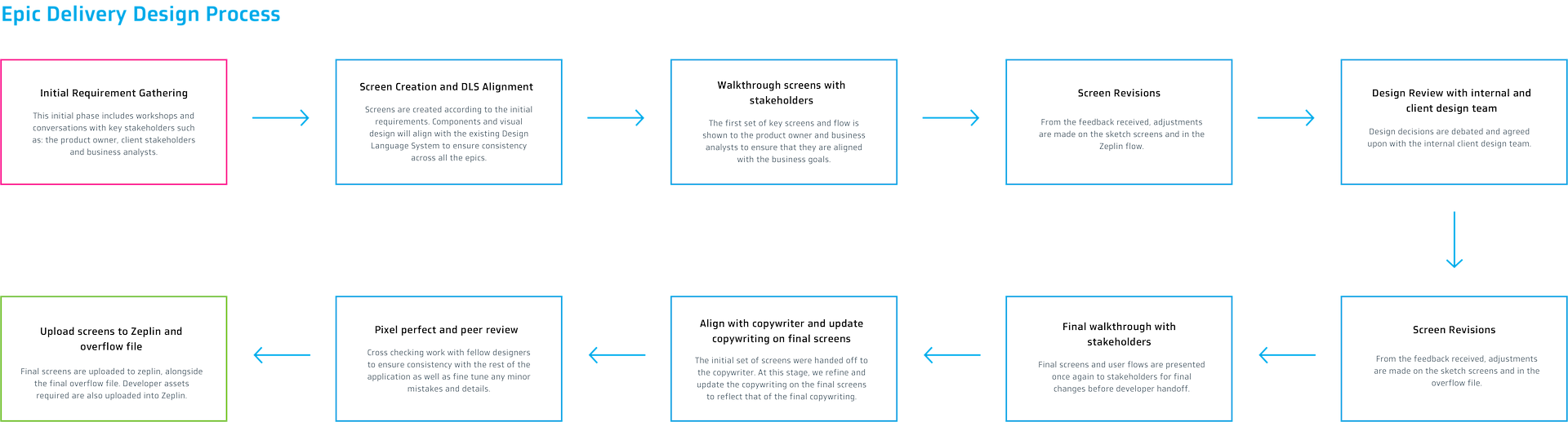
Getting a better sense of the scope was crucial in delivering this large-scale implementation project. Amongst the 5 designers, we delivered screens for 30 distinct epics, amounting to over 800 screens over the course of 3 months. For the sake of brevity and confidentiality in the case study, I will go over our design process of two of the key epics : 1) Notifications and 2) QR Cross Border.
Use Case 1 – Notifications
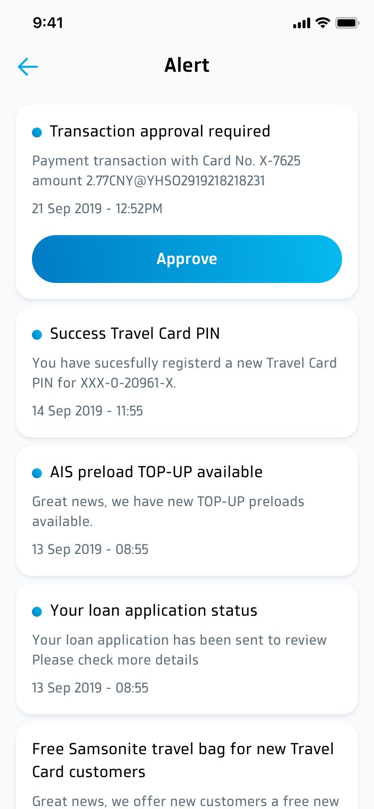
As the mobile banking user, they need to be able to receive notifications for certain actions so that they are able to be updated for activities done using their app. When the user navigates to their inbox, they are also able to see all the notifications.
Working closely with the Business Analysts (to challenge the business flow and ensure that it has the users in mind) and Visual Designer (to ensure consistency with the Design Language System *DLS), I proceeded to create the screens for this epic.
Notification Inbox
- Reused components from the DLS
- Ensure correct use cases for the notifications
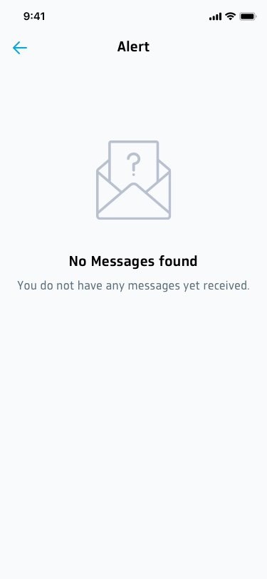
Edge Cases (Empty State)
- In the design process, I also made sure to include to design all the edge cases
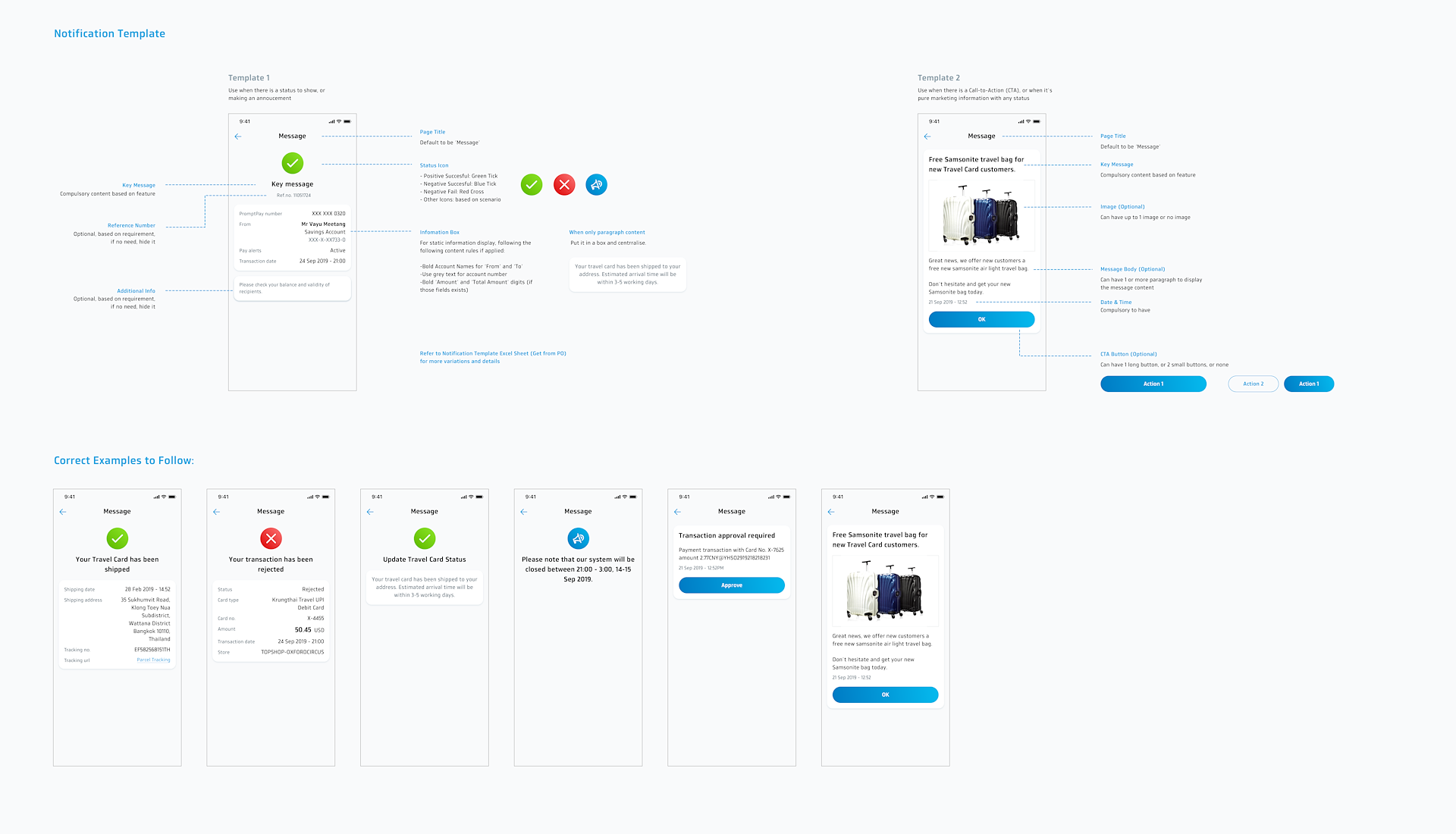
Notification Template
A notification template was also created for future usage. This was created with scalability in mind – so that future designers would not need to create specific screens for each case with a different copywriting. This drastically reduces the time required and is a much more efficient workflow.
Use Case 2 –
QR Cross Border
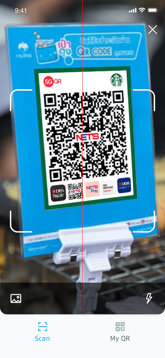
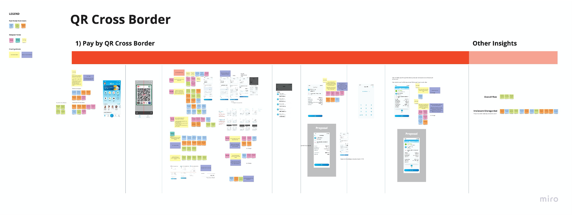
Currently, members of ASEAN often find it difficult to carry out international transactions due to the unavailability of a digital payment platforms that process multiple currency payments within a short period of time.
As a remedy to the problem, Thailand has decided to leverage the QR code technology and offer a seamless cross border payment option. QR code technology enables contactless, fast and secure payments with the use of mobile apps to merchants as well as consumers.
Usability Testing
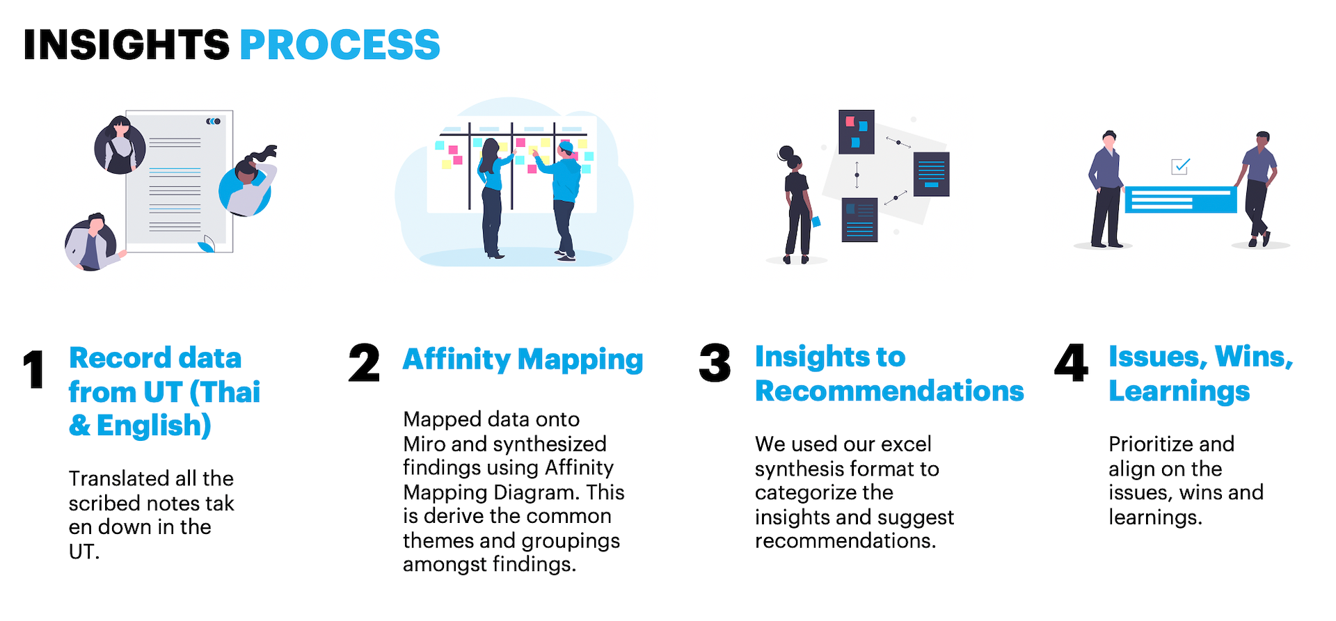
Usability Testing Insights Process
This was how we tackled the data collection -> insights process of the UT. One of the key challenges was that the UT had to be conducted in a bilingual way, hence for each set of data, we had to ensure the translation was accurate and precise.
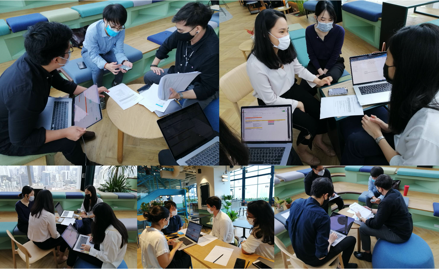
On-ground Usability Testing
Some images from our on-ground testing in the bank’s head office in Bangkok.
Synthesised and grouped data on Miro Board
Design Iterations
Scenario/Use Case
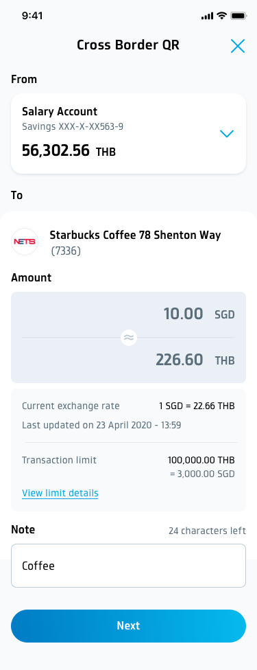
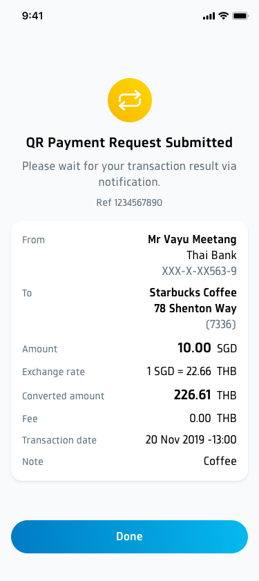
In one of the examples as shown below, the screen depicts the end of the flow of a user making an international payment when he is overseas. In this case, Mr. Vayu is a Thai resident on a holiday in Singapore and making a payment in one of the Starbucks outlets in Singapore.
Before UT
- No distinct separation amongst fields
- Layout of converted amount is confusing
- Users mentioning that they care most about the being able to locate the “amounts” field
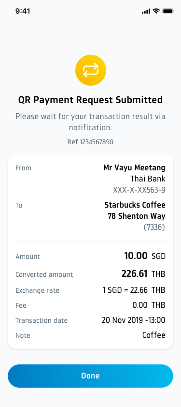
Revisions after UT
Our recommendations:
1) Swap the position of exchange rate and converted amount
2) Add a separation line on top of 'total amount' for this screen
Project Challenges & Learnings
Challenges & Takeaways
One of the key challenges in this large scale implementation project is the inability to fully validate every design with real world users in a tight timeline. Whilst we conducted usability testing for a few epics, it would definitely have been much more ideal to have established a proper research process and for the project to have included a research phase from the start.
Another key challenge and takeaway is the importance of being able to balance UX, Business and development goals and timeline. With over 100 people in total for the entire project – ranging from business analysts, to application architects, to front end developers, this was no minor feat. Often times it is easy to get stuck onto the design and operate through a myopic lens. This project has allowed me to push the quality of design, and at the same time to work with my business and technology counterparts for a joint success.
Impact
Industry
Financial
Services
Platform
- iOS Platform
- (Available to view
- in the App Store)
Keywords
- Interaction Design
- Visual Design
- Design Language System
- Sketch
- Zeplin
- Jira
- Abstract
Metrics
Over 5000 screens
30 unique functionalities
Serving a user base of 3 Million users
10 Million downloads