— YEAR & DURATION
Aug 2020, 4 weeks
— ACTIVITIES
User Research
Heuristic Evaluation
Information Architecture
Visual Design
Wireframes
— ROLE
Interaction Designer
Team of 2 (1 Interaction
Designer, 1 Visual Designer)
Singtel is a Singaporean multinational telecommunications conglomerate and one of the four major telcos operating in the country.
Their current internal mobile and web portal for field engineers was difficult to navigate and did not contain the relevant information. It also did not align with Singtel's brand identity.
The main goal was to evaluate the existing as-is experience, target and identify key user flows, and redesign a new experience so that it is user-friendly and aligned with Singtel's design guidelines.
Discover
Stakeholder Interview &
Heuristic Evaluation
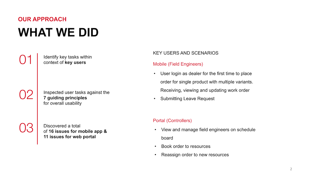
To get a better grasp of our target users and identify key use cases, we first interviewed the client stakeholders (product owner and developer). From there, we were able to understand that the key pain-points experienced arose from two main user groups:
Key Tasks
Field Engineers (Mobile Application)
- View and manage allocated work order
Controllers (Web Portal)
- View and manage field engineers schedule on web portal
- Book and reassign work order to field engineers
We also conducted a thorough heuristic evaluation against 7 heuristic principles for the mobile and web platform to get a better understanding of the current design gaps.
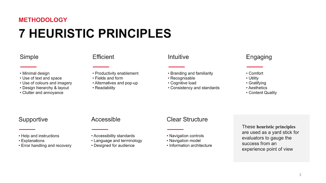
Heuristic Evaluation – Field Engineers
Heuristic Evaluation – Field Engineers
Heuristic Evaluation – Controllers
Heuristic Evaluation – Controllers
User Interviews
In the discovery phase, we also carried out user interviews with 6 controllers and 3 field engineers. The goal of this was to understand their job scope/processes, in addition to gaining deeper insights into their day to day.
Key User Interview Insights
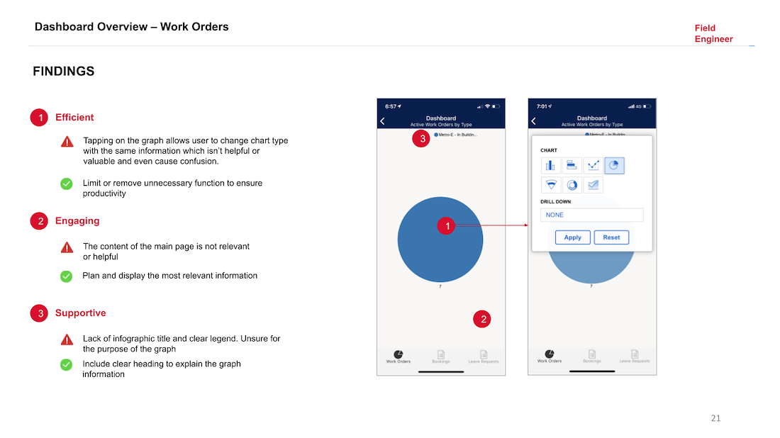
From the interviews, we discovered that for both the mobile and web platforms the dashboard functionality was a shared frustration.
- The mobile application (left image below) had a built in dashboard but that did not aid the field engineers in their work flow in any way.
- On the web portal (right image below) there was no dashboard overview. The controllers lamented about being unable to view all work orders for today and the next two days. They also needed to view the types of jobs and that are currently unassigned.

Mobile Dashboard

Web Dashboard
“It is so messy and there is too much information that I do not know where to find things.” – Field Engineer
Other Concerns
Further concerns from the user interviews include:
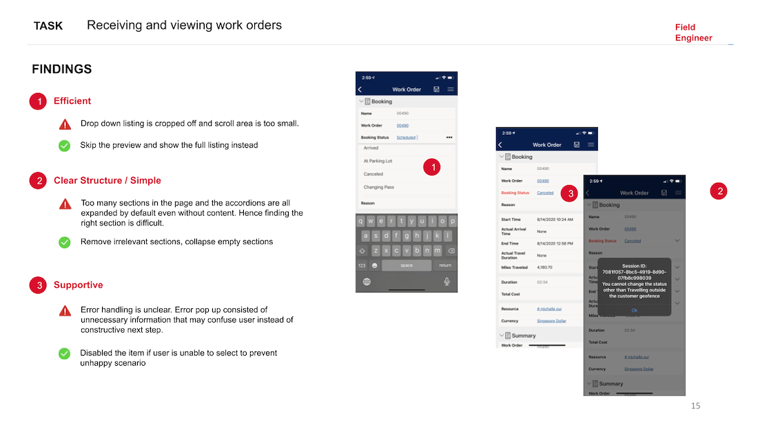
1) Irrelevant information and navigation that is highly confusing
2) Screens are too information dense and there is a long scroll before end of screen (mobile app)
3) Iconography does not reflect actual meaning
Define
Narrowing
the scope
After conversations with the key developer, we uncovered the several limitations of Microsoft dynamic 365. With this out of the box solution, it was not technically feasible to propose and implement a complete visual makeover in the timeline imposed in the first phase of the project.
Knowing what we had to work with, we still wanted to offer a range of options and flexibility in choices, hence we proposed three solutions:
1) Low effort - 0 Customisation, cosmetic changes of colours within the theme file to align with Singtel Branding. Removal of redundant navigation items and reordering
2) Mid effort – Hybrid (a mix of out of the box screens and customised screens)
3) High effort – 100% Customisation
Design (Mobile)
Before
- No dashboard overview
- Confusing and repetitive icons on tab component
- Information is condensed into one screen, endless length of scrolling. Page is also filled with irrelevant information.
After (Full Customisation)
- Dashboard to show field engineers all their current bookings/next bookings
- Streamline tab component
- Removal of unnecessary information and keeping each screen short and concise
- Singtel branding
Design (Web)
Before
- No dashboard overview
- Redundant out of the box functions (Information overload)

After (0 Customisation)
- Give meaningful information in each work order field on schedule board (Configure this section to include Customer information and additional fields)

After (Customised screen)
- Controller dashboard overview
- The dashboard design is informed by our previous user interviews that highlighted that field engineers wanted to see:
1) Number of work orders/scheduled each day
2) Filter work orders that have not been scheduled or are unassigned

Next Steps
What’s next
Due to the time constraints of the 4 weeks project, we were unable to conduct usability testing on our designs. In the next phase of the project, we will validate our findings by conducting usability testing with our user groups and reiterate on the designs.